At time cockpit we are in close contact with our customers and we value their feedback. In one of our meetings with customers, we identified potential for performance improvements when it comes to drop-down lists (combo boxes). So we concentrated on optimizing the combo box experience in time cockpit. This is the first step to a more feature-rich combo box. There is more to come.
Apart from minor changes, another thing we improved in this version is usability in multi-tab forms and modules. You can now use Ctrl+Tab to switch tabs easily without mouse interaction - one of our most customer-requested features.
The new version September 2013 (1.17) is downwards compatible to version March 2013 (1.10) and later. You can use all of these versions in a single account simultaneously.
Combo Box Improvements
In previous versions of time cockpit, combo boxes were sometimes the reason for long load times of forms or filters in lists. On the one hand, the long load time was caused by the fact that time cockpit always loaded all entries of a given combo box. If the combo box contained a large number of items, loading took a while. On the other hand was the fact that users were not able to use a form or filter until all combo boxes had been loaded. With the new version we addressed both issues and changed the behavior.
Configurable Number of Items in Combo Box
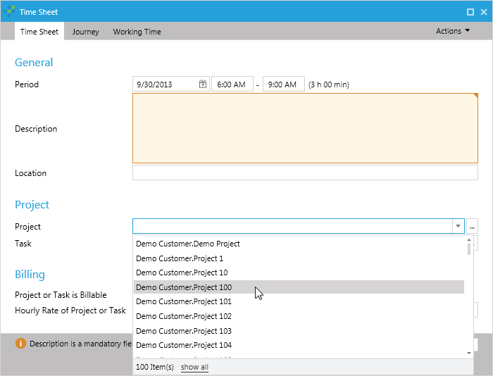
In the new version you can configure how many items of a combo box should be loaded initially. The default number of items displayed in a combo box is 100. You can change the default in the Global Settings in the List Settings section.

If the item that you are looking for is not contained in the configured number of items in the combo box, you can either start typing or load all items from the database. Whenever time cockpit fetches data from the database, it shows a progress indicator in combo boxes that are currently loading data.
Tip: Limiting the number of initially displayed combo box items is most helpful when you work in the Silverlight version of time cockpit or use the server connection of the time cockpit full client.
Parallel Loading of Filters and Lists
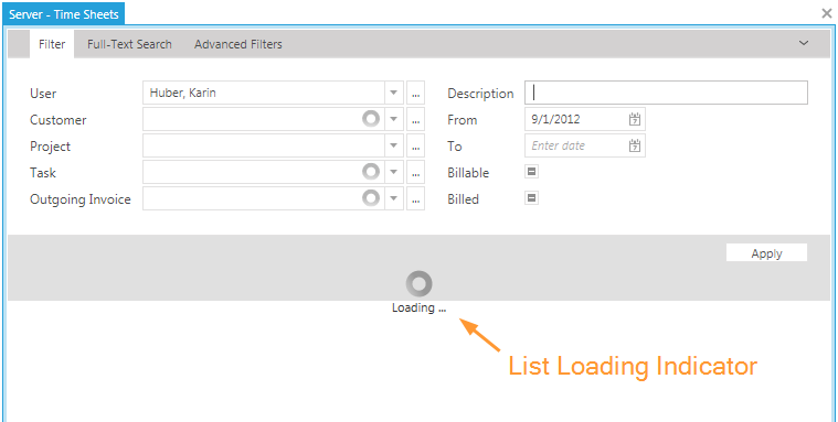
In previous versions of time cockpit, all combo boxes in a filter loaded all their items before the list started to return records. In this version we optimized the behavior. Now time cockpit starts loading the records of the list immediately and loads the other filter combo boxes in parallel.

In the above figure you can see that although not all combo boxes have been completely loaded in the filter, the list is already loading. The only parameter that is required to load the list is User - it was loaded first.
Tabbing (Ctrl + Tab)
Tabbing - a feature dearly missed by our customers. In the new version of time cockpit you can now use Ctrl + Tab to switch between tabs. Tabbing helps to navigate the time cockpit UI quicker without using the mouse. Tabbing works in forms that contain more than one tab, in navigation modules where more than one list is opened and in the customization module.
Minor Changes
- Time cockpit now offers two different options to display the working time chart of a user. Users can either view their actual hours of work as an absolute value or the deviation between planned and actual hours of work. You can change the way of visualizations in the Global Settings under Time Sheet Settings.
 Working Time Deviation
 Working Time Absolute
 Global Settings
- For exporting lists to Microsoft Excel, time cockpit uses the third-party component ClosedXML. In the October version of time cockpit we upgraded to version 0.69.1 of ClosedXML.
- When you clicked a hyperlink in a list in older versions of time cockpit, the record row was not highlighted. That made it difficult to locate the record that was the source of the navigation. Now a row is not only highlighted when it is double-clicked, but also when you click on a hyperlink in that row.
comments powered by