The new version January 2016 (1.44) is downwards compatible to version March 2013 (1.10) and later. You can use all of these versions in a single account simultaneously.
This month our main focus was adding responsive design to our HTML5 client. Our goal is to make time cockpit's web client usable on phone, tablets and in desktop browsers. We have not reached our final goal yet but we have made significant progress this month. Try it and tell us what you think.
Responsive Design
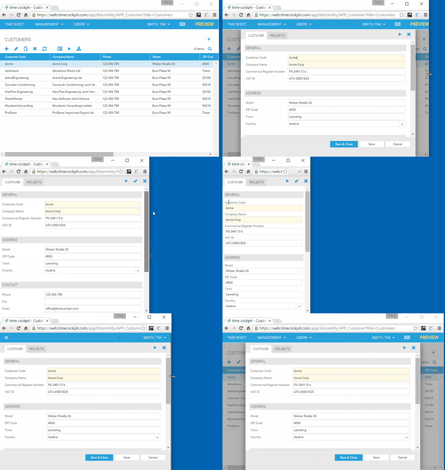
Time cockpit's HTML5 client now changes its layout depending on the size and layout of the screen. The animated picture below demonstrates the concept by changing the size of the browser window.

Depending on the available screen size, time cockpit changes it appearance for instance by ...
- ... showing/hiding menus and menu items.
- ... displaying action buttons (e.g. save, close) differently.
- ... disable multi-column layout of large forms into a single-column layout (e.g. for phones or small tablets in portrait layout).
- ... put lables above input fields.
Mobile Friendly
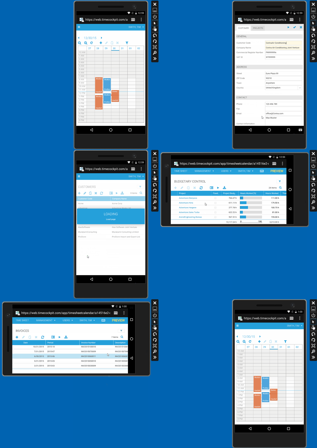
In some cases, responsive design is useful in your desktop browser, too. However, it is really important when it comes to phones and small tablets. The following animated picture shows the current look-and-feel of time cockpit's HTML5 client on a 5" Android phone. Forms already work quite well. We still have some work to do for lists.

Full Client Bug Fixes
We have added some enhancements and fixes for minor bugs in time cockpit's full client this month:
- Enhanced logic for detecting out-of-date devices (i.e. devices, that have not sync'ed for such a long time that a complete re-sync is necessary)
- Fixed minor bugs regarding vacation and overtime functions in TCQL
- Enhancements to many-to-many relation cells (feature of time cockpit's forms engine)
comments powered by