Agreed, data is what drives most businesses. However, having a lot of data at your disposal often does not give you much insight. This is because data gains value with the way it is presented.
In this article, we explain how to set your data in a geographical context. We use Microsoft Excel, Power View and time cockpit's brand new OData Web API to create an interactive map that lets you browse your data the way you want.

What's In It for You?
Time cockpit already offers various ways to display your data. First, you can view your data in lists directly in time cockpit. In lists you can filter your data and interactively change the sorting and grouping of the list. If you run into scenarios where you want to represent your data in a nicely formatted, printable report, you can use time cockpit's reporting capabilities that were introduced in the April 2014 version of time cockpit.
But what if you do not want to trade the interactivity of time cockpit list for the advanced formatting capabilities of time cockpit's reporting capabilities? One way to handle the issue is to use time cockpit's brand new OData Web API.
The Scenario
Imagine that you are overall sales manager for an internationally operating company. Your company has three main revenue drivers: consulting, hosting, and product revenue. Sales figures are not developing as you like in some regions of Europe. You have the data, but you are lacking a compelling way to represent it. Ideally, you like to display your sales figures in a geographical context to get the message to top management.
Your company uses various BI tools and, of course, Excel. You know your way around those tools, so why not use Excel to present your data the way you want.
Prerequisites
For this example to work, you need the following tools:
- Microsoft Excel 2013
- Microsoft Power View (shipped with Excel 2013)
Fetching the Data
First we need to connect to the time cockpit database to get the data we would like to process in Excel. For that, we use time cockpit's new OData Web API. In Excel 2013 you can plug in to different data sources. You can fetch data from a SQL Server (see also this article), from an XML File, and also from an OData Data Feed. In this example we consume the OData Feed provided by time cockpit.
In the DATA tab in Excel click From Other Sources and From OData Data Feed to establish a connection to the time cockpit server. Excel will prompt you for a link where your OData endpoint is hosted. For now, the endpoint is https://apipreview.timecockpit.com/odata. Excel also asks for your credentials. Please use your time cockpit credentials that you used to initially configure time cockpit or to log in to our website.


Please keep in mind that this article uses the API preview OData endpoint. The URL https://apipreview.timecockpit.com/odata is subject to change and will be replaced with another URL in the near future.
When you have successfully authenticated with our OData endpoint, Excel will present you a list of all database tables that are available for processing in Excel. In this example, we will only fetch two tables: APP_Timesheet and APP_Project. When you click Next, Excel asks you for a name for your OData connection. Since we are fetching timesheets and projects, we simply call it TimesheetsAndProjects. Click Finish and Excel will start to load your time cockpit data into Excel.


Loading your data from the web may take a while. How long it takes depends of the amount of data you are loading. After Excel has finished to load the data it will ask you how to present the data it fetched in Excel. You can show your data for example as normal Table or as PivotTable. In this example we will use our data in a simple Excel table.
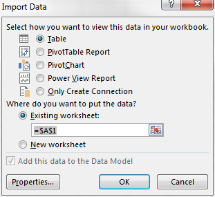
Excel will load the data from the OData endpoint and drop it into an existing worksheet. We have all the necessary data in Excel now and can continue formatting it in a more meaningful way.
Presenting the Data
It is time now to present your data in a more visual way than in a table. To load your data into Power View, mark the table containing the time sheet entries and switch to the INSERT tab in the Excel ribbon menu. While still having marked your table, click Power View in the ribbon. If this is the first time you use Power View, Excel will automatically load the necessary components. After Excel has loaded the components it will open a new worksheet for you displaying the data of your table in the Power View worksheet.
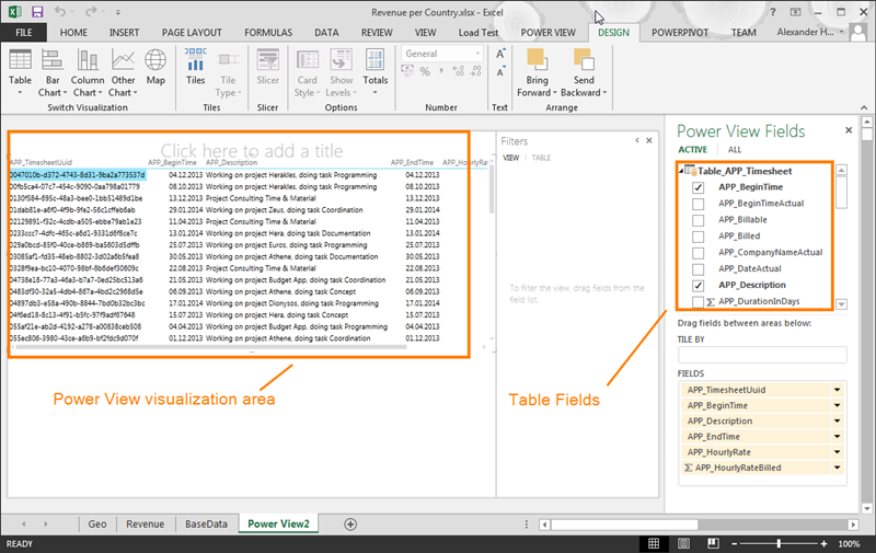
In the Table Fields area you can choose which fields of your selected table to display in the Power View visualization area. Per default, Excel will choose fields that are not very helpful for our scenario. For us, the three important fields are Location, Revenue Category and of course the sum of the revenue per location and revenue category. So we add only these three fields to the Power View visualization area by selecting them in the Table Fields area.
To display the data in geographical context you select the Power View visualization area and click Map in the DESIGN tab in the ribbon. Excel will present you with a visualization proposal that does not quite fit our needs. To visualize the data in a more useful way, drag the location fields from VERTICAL MULITPLIES to LOCATIONS.
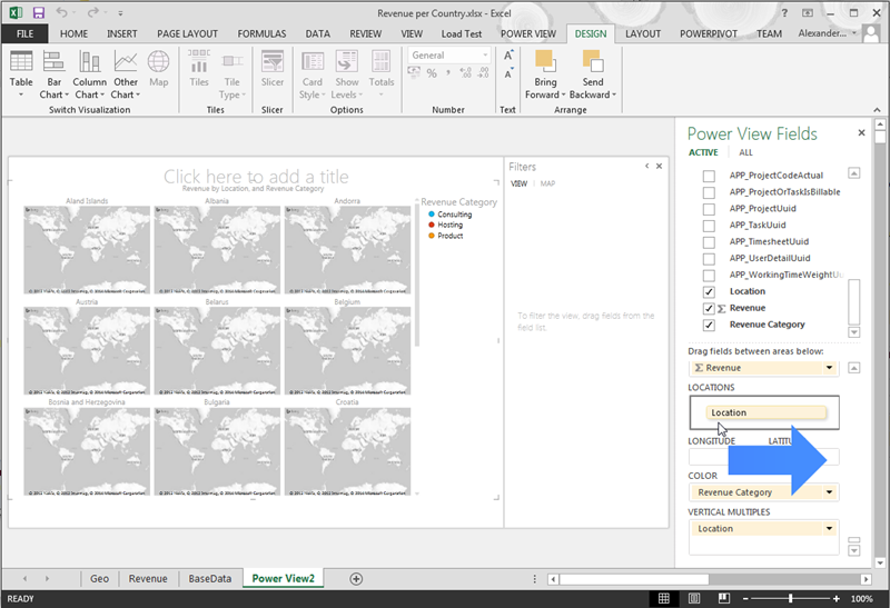
Having told Excel which fields holds the location information aggregates you sales figures in one single map. Automatically, Excel creates pie charts for the revenue of each location. The size of the pie charts is determined by the revenue. The color of the different parts of the pie chart is determined by the revenue category.
You can now start to design the visual report by adding for example additional filters. Add additional filters by dragging the fields you want to filter for from the Table Fields area in the Filters area. In this example, we have added filters for location and revenue. Note that Excel provides meaningful controls for each filter type. Revenue, for example, represent a number. Thus, Excel renders a slider where you can configure the range of revenue you want to see in your map. Location, on the other hand, is as text field. Thus, Excel presents you a list of all possible locations and you can choose which ones to display in the map.
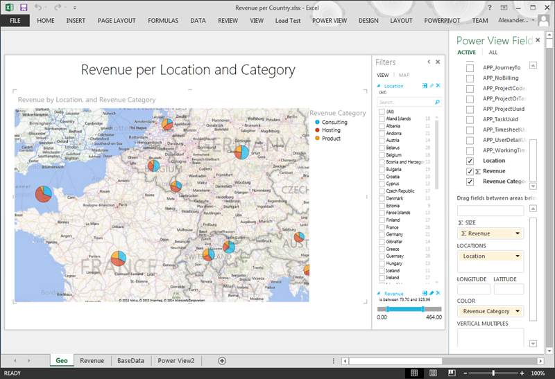
Now you can view your sales figures in a map in Excel and can interactively change what data you would like to show. You can, for example, decide to view only certain countries that are in a given revenue range. Power View will automatically update the data in your map.
Summary
In this article we described a simple scenario how to consume data from time cockpit's OData Web API and process it in Excel. We used Excel Power View to create interactive reports that facilitate the Bing Maps engine. This different approach should help you to present your data in a more expressive and fancy ;-) way and gain more insight into the figures that drive your business.
Further Reading
comments powered by