Example for a sales report that AIT has created with Power BI based on time cockpit data
Microsoft Power BI is getting more and more attention in the market. We get questions about integrating our project time tracking solution time cockpit with Power BI frequently. AIT, one of our long-term time cockpit customers, shared some of their time cockpit-related Power BI dashboards with us. We have spoken with Lars Roith, CEO of AIT. He describes what AIT has built using Power BI and time cockpit and how they use the dashboards to manage their team.
AIT GmbH & Co. KG, founded as a limited liability corporation in 1991, is the leading provider of individual, innovative software solutions based on the Microsoft .NET platforms. AIT is a Microsoft Gold Certified Partner and the established service partner for software lifecycle management solutions based on the Team Foundation Server (TFS) and the Visual Studio (VS). We have been a trend-setting Microsoft .NET technology partner since 1991. Thanks to our experience and expertise in business-critical applications using the Visual Studio Team Foundation Server, we have successfully implemented complex .NET software solutions not only in the industry environment, but also for the trade and distribution sector, insurance companies, and financial service providers. Read more about AIT's offerings...
Lars, Why Do You Use Power BI?
Power BI is like YouTube for Excel. It is great for sharing data, models and visualizations with other team members.
We use the powerful modelling functions of the Power BI Desktop. With that, we can add logic and abstractions. Additionally, it allows us to integrate data from multiple sources. We do not have to care about refreshing data in Power BI. This happens automatically in the background. No scripts or manual triggering needed.
Once data has been made available to Power BI, the system shines with great visualizations. A lot of powerful charts are included out of the box. Beyond that, Power BI is even open for custom visualizations. The charts are not just images. They are interactive which makes it much simpler to tap into the data. Over time, we have tweaked our dashboards so that they support our planning processes as well as marketing and sales activities.
Finally, Power BI is simple and easy to use compared to other solutions like SSRS (SQL Server Reporting Services). If you know how to use Excel, you will not have problems with Power BI. Even advanced features like DAX are easier to use than comparable systems like MDX.
Where Do You Get the Data from?
Most of the data comes directly from time cockpit's OData interface. Some data - especially the large time sheet data set - is read directly from our time cockpit SQL database cluster because of performance and stability reasons. To do time series analysis, we created a continuous date and time table in Power BI and connected it with data from time cockpit.
Can You Show Us Some Examples for Dashboards?
Paid Time Off and Sick Leave
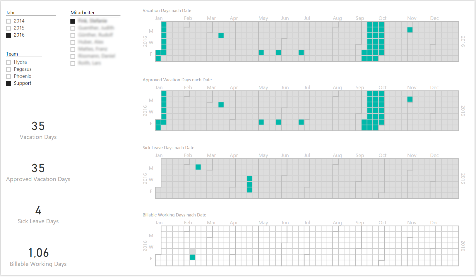
This dashboard shows booked and approved paid time off as well as sick leaves. It provides an overview for team- and project-managers about availability of their team members. If they meet with customers, they can quickly respond to questions regarding available resources for upcoming projects. Power BI filters allow the user to focus on the necessary level of detail - total, team-level or employee-level. This dashboard does not replace detailed resource planning. This is done separately by the managers.
Note: Time cockpit is not only a great project time tracking system. It also supports maintaining vacation entitlements, paid time off, sick leaves, compensatory time etc.
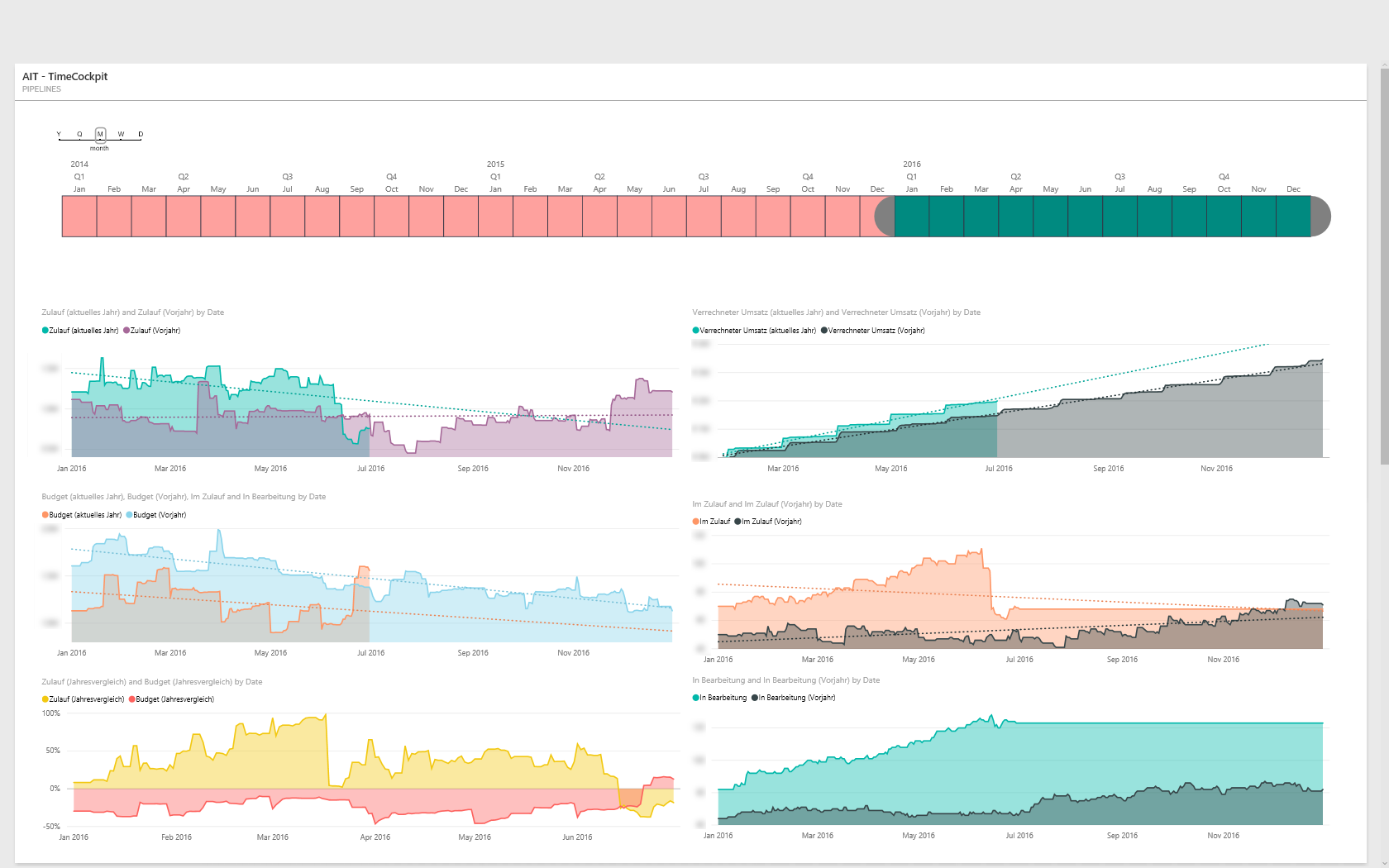
Budget for Open Projects
Here you see a dashboard with a bubble chart in the upper right corner. The color of the bubbles indicates the probability of the project to be done as planned estimated by the responsible team member. The size of the bubble shows the remaining budget. The position on the X-axis indicates the time since the last activity in the projects.
We use this dashboard in combination with our CRM for sales planning. It helps us identifying customers who planned projects, allocated a budget for it but did not use it for a long time. In such cases, we want to find out why the project has not been done as planned. Maybe we can help the customer removing road blockers to get the projects started.
Note: Time cockpit's database has budget-related fields on project- and task-level. Basic visualizations for budget utilization of projects and tasks is included in time cockpit out-of-the-box. Advanced views can be created with reports or, as shown here, with Power BI.
Assuming that most projects are done as planned, the dashboard helps us in financial forecasting and resource planning. The growth of the team must be aligned to the project pipeline. If it doesn't, we have to do a root cause analysis.
Team Structure
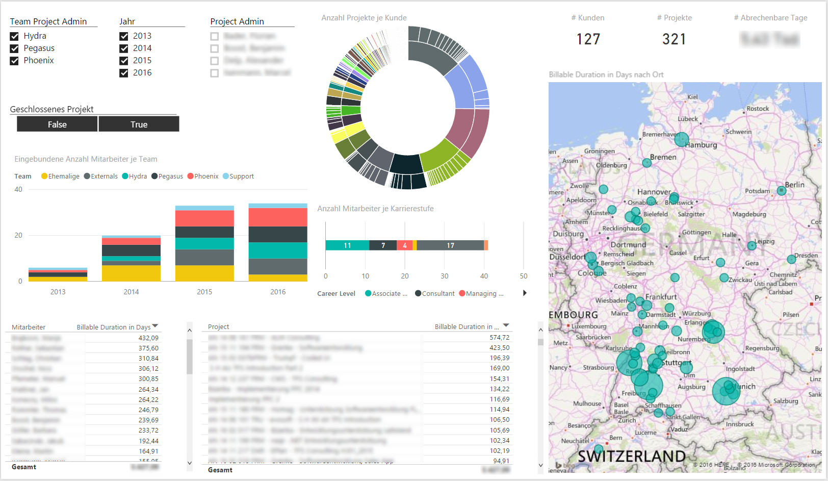
We use this report to assess the "health" of the team structure. Do we have the right mix of experience ("career level")? How many members does each team have? How many billable hours does a team produce? This dashboard answers questions like that.
Team Utilization
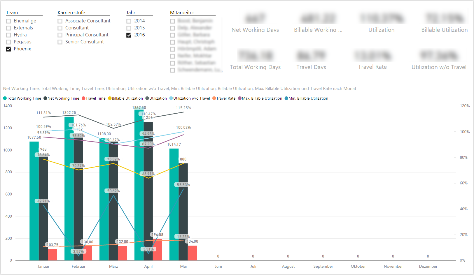
We have highly motivated teams that want to compare their results. One important criteria are the ratio of billable hours. The team can compare its performance against the overall performance of the company. Additionally, this dashboard contains KPIs about travel time and overtime hours. Travel time is inevitable in consulting business. This dashboard helps us to ensure that we have a fair distribution of travel times over all teams.
Note: Time cockpit supports entering travel times out-of-the-box. Some customers have even automated per diem calculation inside time cockpit. Overtime calculation is also built in.
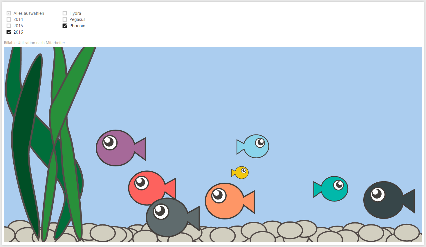
Data can be fun, too. Power BI also contains a humorous way of comparing items. We have used it to visualize the teams' performance:
Lars, How Do You Use These Dashboards?
Not a single strategic- or personnel-related decision is made by just looking at dashboards like the ones shown above. They are one tool out of many that AIT uses to successfully manage projects and customer relations.
Self-organization, self-responsibility and transparency are important values at AIT. However, not all dashboards are available to all employees. This is not done because of secrecy but to avoid distraction and misunderstanding. To understand and interpret some KPIs, one needs certain background knowledge. Therefore, if we share the dashboard, this happens in a moderated way.
Note: Time cockpit has a powerful permission system built in. We ship a rudimentary configuration that can be extended to suite each customer's specific needs.
Lars, What Ideas Do You Have for Future Enhancements?
In the future, we want to integrate data from CRM and time cockpit to get more insight about a project's way from first customer contact until its delivery.
Another area where we want to add dashboards is individual goals for employees. The necessary extensions have already been done in time cockpit. Power BI visualizations will come next.
Our current dashboards focus very much on revenue. Over time, we want to add cost-related data, too.
Note: Time cockpit has database fields for cost-related data for employees. Additionally, time cockpit's data model is extensible without writing code for that. Customers can create additional tables, fields and relations as needed. Of course these extensions can be added to time cockpit's UI (e.g. lists, forms, menu), too.
Thank You
We want to thank Lars for sharing his experience.
If you ever need consulting for ALM or development support for your software solutions, don't forget to check out the guys from AIT!
comments powered by