In our next version we will add new column types to display bars in lists. We will support three different types of bars: data bars, stacked data bars and bullet graphs. The technical implementation is nearly done and now we are focusing on use cases for the new cell types. The following three examples show how each of the bars can be used.
We would love to hear from you where you would like to see the new data bars in time cockpit. Which lists are you using for managing projects, invoicing, etc.? Where would the bars help you doing your work? Join our groups in Xing and Google+ to share your ideas or send your feedback to support@timecockpit.com.
Data Bar
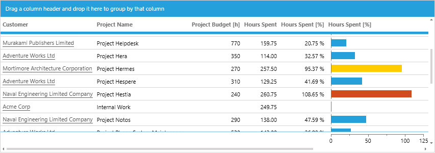
The data bar allows you to display one value. The following example shows the number of hours booked on a project in percent of planned hours. If the utilization exceeds 80% we change the color of the bar to yellow. Overbooked projects are red.

Stacked Data Bar
The stacked data bar allows you to display a fixed number of dimensions in different colors. The following example shows three values in the user list: the percentage of billable hours (blue), the percentage of non-billable hours (gray), and the percentage of hours that are not assigned to a project (red).

Bullet Graph
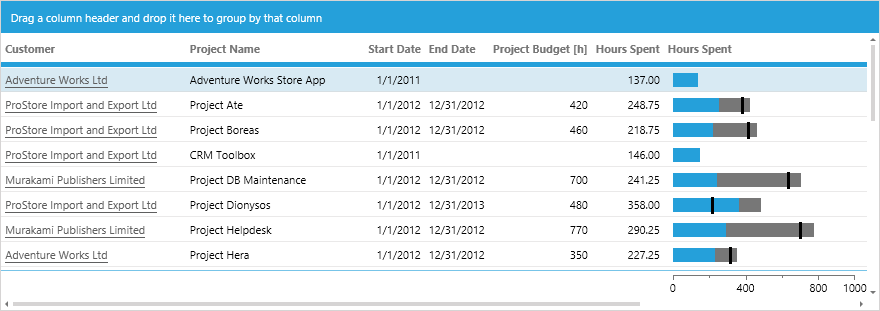
The bullet graph allows you to compare three values: the actual value, the projected value and the comparative value. In the following example we show the actual hours spent on a project (blue), the planned hours for the project (gray), and the planned number of hours until today considering the start and end date of the project (black line).

Configuration
You will be able to use the new cell types in your own lists, too. The following examples show how we configured the lists above. The names of the cells and the properties may change in the final version.
Data Bar
 <DataBarCell Value="=Current.Utilization" Minimum="0" Maximum="125" Width="200"
    NumberFormatPattern="'Utilization:' #,##0 '%'"
    ValueBrush="=:Iif(Current.Utilization > 100, '#d24b1e', :Iif(Current.Utilization > 80, '#ffcc00', '#25a0da'))"
    Header="Hours Spent [%]" />
Stacked Data Bar
 <StackedDataBarCell Minimum="0" Maximum="100" Width="250" NumberFormatPattern="0.00 '%'" Header="Billable / Not Billable / No Project Assigned">
    <StackedDataBarItem Value="=Current.HoursBillable / (Current.HoursBillable + Current.HoursNotBillable + Current.HoursWithoutProject) * 100" />
    <StackedDataBarItem Value="=Current.HoursNotBillable / (Current.HoursBillable + Current.HoursNotBillable + Current.HoursWithoutProject) * 100" />
    <StackedDataBarItem Value="=Current.HoursWithoutProject / (Current.HoursBillable + Current.HoursNotBillable + Current.HoursWithoutProject) * 100" ValueBrush="#d24b1e" />
 </StackedDataBarCell>
Bullet Graph
 <BulletGraphCell Value="=Current.SpentHours" ProjectedValue="=Current.BudgetInHours" ComparativeValue="=Current.PlannedHoursUntilToday"
    Minimum="0" Maximum="1000" Width="200"
    NumberFormatPattern="0.00"
    Header="Hours Spent" />
Limitations
There will be some limitations in the first version:
- Minimum and maximum value cannot be calculated automatically depending on the values. When defining a list you have to specify valid boundaries.
- The bars cannot be displayed in group headers.
We Need Your Feedback!
Tell us where you would like to see the new data bars in time cockpit. Join our groups in Xing and Google+ to share your ideas or send your feedback to support@timecockpit.com.
comments powered by